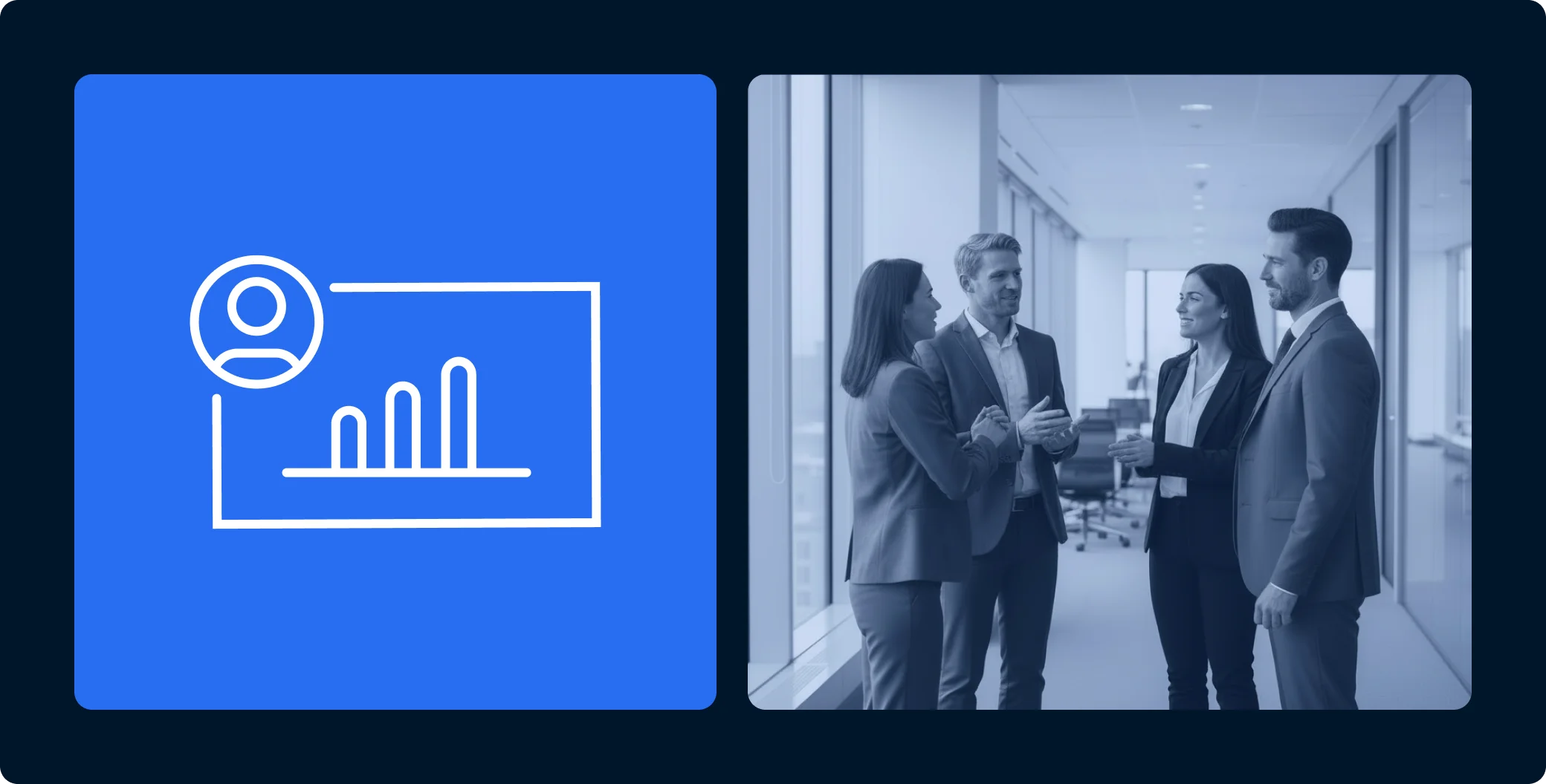
The significance of an Investor Portal in the LPs’ investment journey cannot be overstated. The portal serves as the one source of truth for LPs and as the primary communication channel between the GP and their LPs.
You can even argue that, in a sense, for investors, the Investor Portal is the GP, and the GP is the portal: it’s an inseparable part of how they perceive their GP, as most of their day-to-day interactions are through this online platform.
That’s why when we came to create Agora’s Investor Portal, we put investor experience as a top priority: We wanted investors using the portal to (1) get what they need as quickly as possible and (2) Enjoy using it.
In this article, I’d like to share how we approached designing the Agora portal, as it shines a light on how we achieved the goal of making it the most investor-friendly portal in the market.
The three core values that guided us in designing Agora’s Investor Portal
The goal for us is that our customers’ LPs not only get the information they need but also do it with zero-effort and can start using the portal right away with no learning curve.
We also wanted to provide a real white-label portal so the LPs don’t see an “Agora” generic Portal – they see it as their GPs’ Portal.
So here are the three values that underlined our mission when we set out to design the most investor-friendly portal in the market:
- Functionality and ease-of-use: Simplicity and functionality are two complementary qualities. If a user needs to make an effort to find what they’re looking for or take action, we’ve missed our mark on functionality. That’s why our goal was to provide true functionality supported by an interface that’s as intuitive and easy to use as possible, even for users who are not tech-savvy at all.
- Aesthetics: There’s no second chance to make a first impression. We wanted to convey a professional, modern look and feel. We achieved it through a plush, clean design with minimalist layouts and contemporary elements.
- Customization: The portal is not our portal. It’s our customers’ portal, especially as far as their LPs are concerned. That’s why we wanted to give our customers the ability to make the portal look and feel like a natural extension of their website, with their individual logos and brand colors.
From theory to execution
There are four main use cases for an LP’s activity in the portal. An LP wants to:
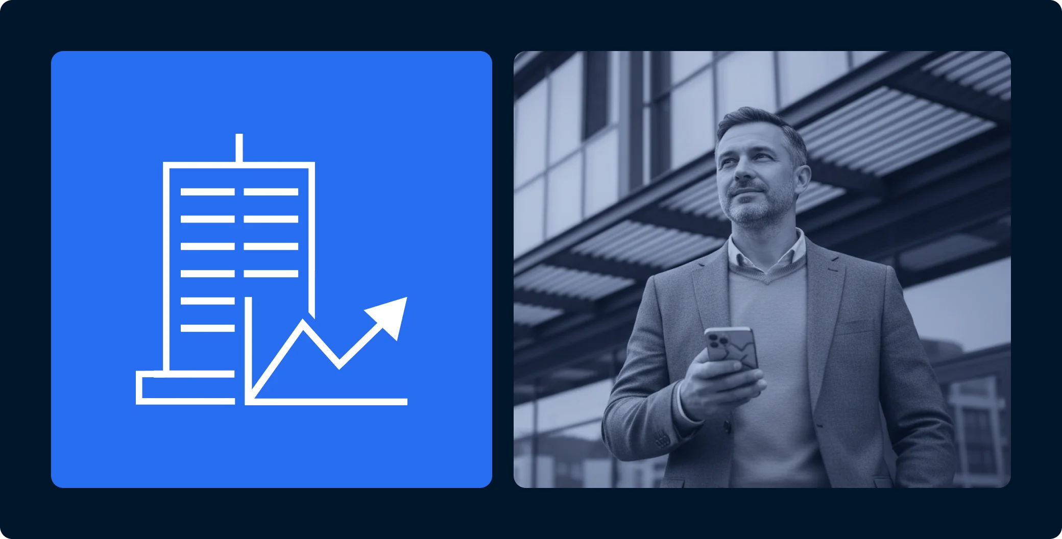
- Get a high-level overview of their portfolio.
- Find and view important data about their investments.
- Find, view, and download documents and reports.
- View and subscribe for new offerings.
So we divided the portal into four distinct sections:
- Overview (main dashboard)
- My investments
- Documents
- Offerings

We were careful not to divide the portal into more than four sections to maintain simplicity and ease of access: Imagine a home where the bedroom is separated into three rooms – the dresser is in one room, the bed is in another, and the closet is in a third. It’s the same for online user experience – the fewer functions are spread out in different “rooms”, the smoother the experience for the LP.
Let’s go through each section in detail.
The dashboard acts as a lobby where the LP can get a high-level view of relevant information:
- General financial metrics.
- Live offerings.
- Recent updates.
The overview is the first screen the LP sees upon logging into the portal. When providing an overview, the first instinct is to give LPs a lot of information upfront. However, overwhelming users with too much information at the outset leads to frustration and difficulty finding what they came for on the portal.
That’s why we established a clean overview screen to help the LPs get comfortably acquainted with the portal.
The LP gets all the essential information displayed crisply and instinctively understands where to go for more detailed information or to take action – it’s all within reach.
We’re also adding a new feature to help LPs get faster acquainted with the portal, where they get on-screen guided notifications for recommended actions.
For example, if there’s a new quarterly report, the LP will get a dedicated notification pointing to where they need to click to view it.
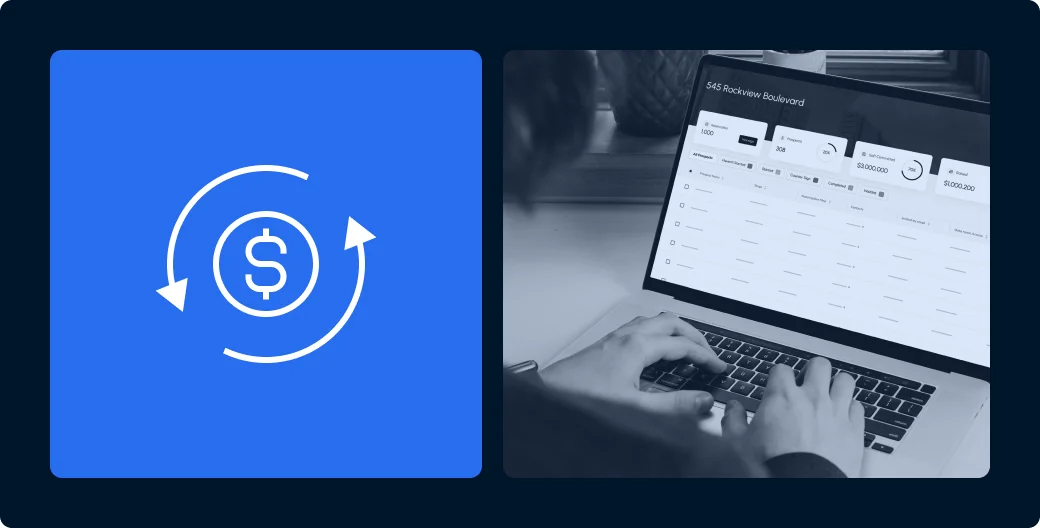
My Investments
Here the LP can get an overview of all their investments on one screen, including details on each investment.

The investments are displayed not only by name but also with an image for two reasons:
First, The human brain processes images 60,000 times faster than text, meaning – the LP will be able to recognize each investment and find what they’re looking for faster and more conveniently.
Second, aesthetically speaking, their portfolio looks much more impressive when displayed with images of their investments.
From the “My investments” screen, the LP can go into each investment, see its status, and all information relating to that investment, including reporting, metrics, transactions, and more. The LP can also access the documents relating to these specific investments.

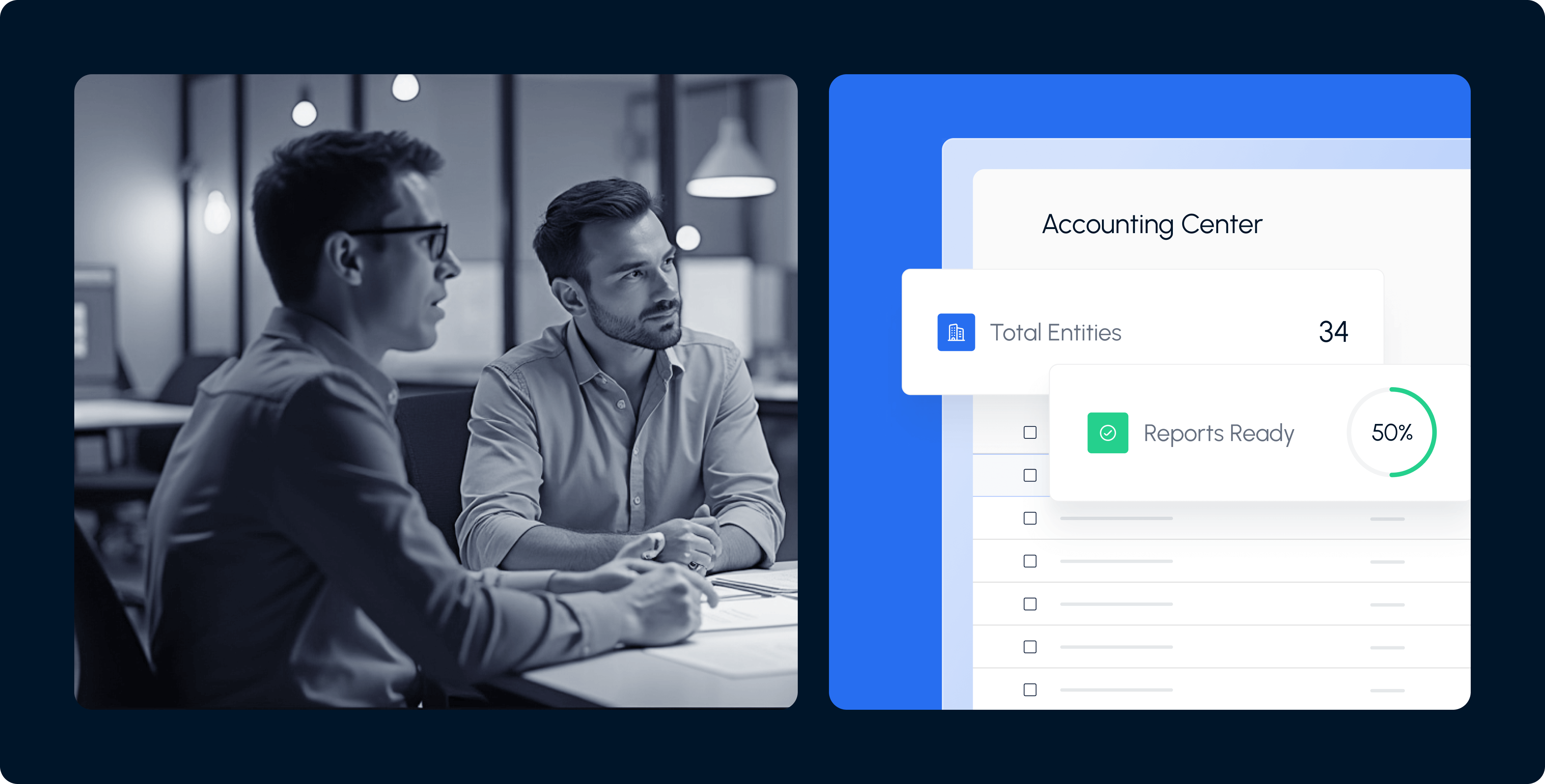
Documents
As I mentioned, the LP can access documents from the investment page, but they can also access all their documents from the dedicated “Documents” screen.
This is a great example of how we apply the functionality/simplicity principle to promote convenience – the LP can get to information or perform actions through multiple touchpoints in their journey. We want them to intuitively get to where they’re going without overthinking or having to start navigating around the portal.
That’s why LPs can reach a document (or a group of documents) from the general “Documents” screen, but also when they’re already inside a specific investment screen. We apply this principle across the portal to enable the LP to take actions more intuitively.
When the LP is on the “Documents” screen, they will see the documents categorized by type (K-1, annual reports, distribution notices or capital calls and so on), as this is the typical use case for LPs – they’re usually looking for documents by type.
Additionally, LPs can sort or filter the documents by different parameters such as date, investment, and even by document type – whether it’s their K-1, annual reports, distribution notices, or capital calls.
So let’s say an investor wants to view only distribution notices from one specific investment – they’ll only need two clicks to find what they’re looking for – marking the investment, and the document type.
Offerings
I consider our new “Offerings” feature to be exceptionally remarkable, as we were able to create a seamless flow that supports all use cases of fundraising, based on a deep study of our users’ behavior.

As a result, we were able to equip GPs with the ultimate tool to simplify the subscription process for their LPs.
First, the subscription experience is broken down to a guided step-by-step journey, where in each step the investor is prompted to complete only one action. Moreover, the investor has the option to hit “Save and quit” at any stage and resume the process at a later time.

We also gave GPs the ability to tailor different subscription flows for different LPs in the same deal, like in the case of family offices (where some of the LPs’ only needed contribution is their signature), or if specific LPs need their legal rep to sign off on the deal.
The result is a smooth subscription journey for the LPs combined with flexibility for the GP, resulting in faster fundraising and an improved investment experience.
Agora’s Investor Portal – an unparalleled investment experience
Architect Louis Sullivan famously coined the principle of ‘form follows function.’
Agora’s Investor Portal exemplifies this principle by putting functionality, simplicity, and convenience at the forefront. The result is an unparalleled investment experience for our customers’ LPs.